This is mainly a post containing any further research i have done in to films and film openings. I will compare film openings from the ones that I like, to the ones that I don't like. The ones that i like will probably be from around the Film Noir genre, so it will relate to the coursework in some ways. I will also look in to the ways in which Mise-en-Scene has been considered in these film openings to show a deeper / insightful meaning to the story. This post may include openings from different genres also, and display statistics and how that could link to the quality of the film opening and the film in general.
It will mainly use videos and screenshots from previous posts, but now in this post i will begin to put them in to context as to how they will help me (inspiration wise) when creating our final production.
It will mainly use videos and screenshots from previous posts, but now in this post i will begin to put them in to context as to how they will help me (inspiration wise) when creating our final production.
The first thing i need to look in to would be a few generic orders of titles shown within film openings, and how that compares to one of the film Noir order of titles i have analysed.
A generic layout
PRODUCTION COMPANY presents
a NAME LASTNAME production
a NAME LASTNAME film
"TITLE"
Lead Cast
Supporting Cast
Casting Director
Music Composer
Costume Designer
Associate Producers
Editor(s)
Production Designer
Director of Photography
Executive Producer
Producer
Writer(s)
Director
The first three titles need to be kept the same throughout no matter what. They still stay the same no matter what company produces the work, be that niche or mainstream. As for the parts that come after the most important three, the titles are in a good running order. Another thing which is always kept the same is the Director being the last credit. We will have to keep these within our own film opening to make it look like a realistic production. The order concerning the rest of the sequence i will have to take inspiration from. However, i will need to combine elements from other film openings though to make sure i have done the correct. judging from the name of the website i got it from (http://www.indietalk.com/showthread.php?t=14862), This specific order would be from an independent production, which is not the sort of institution we want to be, but if the running order of titles is good, i will take inspiration from it.
A title order of a film genre i have already analysed (Refer to film opening timelines post > Guardians of the Galaxy)
"TITLE"
Casting By
Music Supervisor
Music by / Composer
Visual Effects Producer
Visual Effects Supervisor
Costume Designer
Editors
Production Design
Director of Photography
Co-Producers
Executive Producer(s)
Produced By
Written By
Director
Guardians of the Galaxy is a mainstream production, but the credits order during the film opening remains very similar to that of a Niche opening, which honestly confuses me, because i thought that dependent on the production company, the order may change, and there would be less to show on the screen, but that is not the case. Therefore it is lucky that i actually decided to look in to this, otherwise i may have ended up implementing an incorrect running order of titles in the mainstream production that myself and my group are creating.
Guardians of the Galaxy film opening sequence: https://youtu.be/x_jRQBGKPaA
I have put this here for reference, to show how this specific order can be shown within a mainstream production, and how transitions are used between titles, and how this can be implemented in to our own production.
Use of Font

For this i will be referring back to my "Dawn of the Dead" blog post
 I think the use of font style in this opening is outstanding, mainly because it is dynamic, meaning it changes and moves dependent on the scene in the background. I have already brought this up in the original blog post, but the font is supposed to represent blood. I know this because of the fact that the text smears across the screen after a couple of seconds after its initial presentation. From this one individual feature, even without foreknowledge of the events which take place in this film, it becomes obvious that one of the films genres is "Thriller", as blood is one of the genres generic conventions, so it is no surprise that this is shown within the first few seconds.
 The font is bold, generic of an action film, which also happens to be one of the films main genres also. This becomes especially prevalent when the title of the film is shown
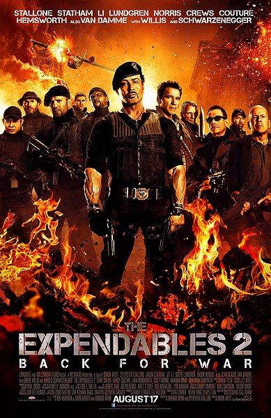
The examples below show this generic font to fit the theme also.
↓↓↓↓↓↓↓↓↓↓↓↓↓↓↓↓↓↓↓↓↓↓↓↓↓↓↓
 |
| These are examples of the font used in the action movie genre, they aren't specifically from opening sequences, but they are some well known action titles within the industry, and coincidentally, uses a bold, formal font |
The use of font mainly abides to the use of generic conventions within the genres that the film is trying to appeal to, as seen in the examples above.
Using this knowledge, how can this applied to Noir Films, and how can it also apply within our own production?
Again, i'm using Act of Violence (1948) as it shows the conventions of a film opening in the Noir genre, so analysing this will really help give me insight as to how this genre is presented.


These examples all have multiple things in common, Font style being one of them. The font style in all of these reminds me of very vintage representations, but i guess these films were produced during the time where the vintage style was the norm. I chose the posters for these films (apart from double indemnity) because they would be the best to analyse as posters are supposed to be made to appeal to a particular audience. Nowadays, this vintage style would appear to appeal to a niche audience, and is usually produced by an independent institution.
For our film opening, we will need to make the font appear the same as the ones used here, as it is very generic that a film from this genre will use this vintage font, as it set it's identity of the time which stands out above the modern day looks within films.
Conclusion
Independent research in to film openings gives me a specific insight as to how these specific scenes are composed, and how there is more that meets the eye when a films opening is fully analysed and all aspects of its individuality and conventions have been considered.
No comments:
Post a Comment